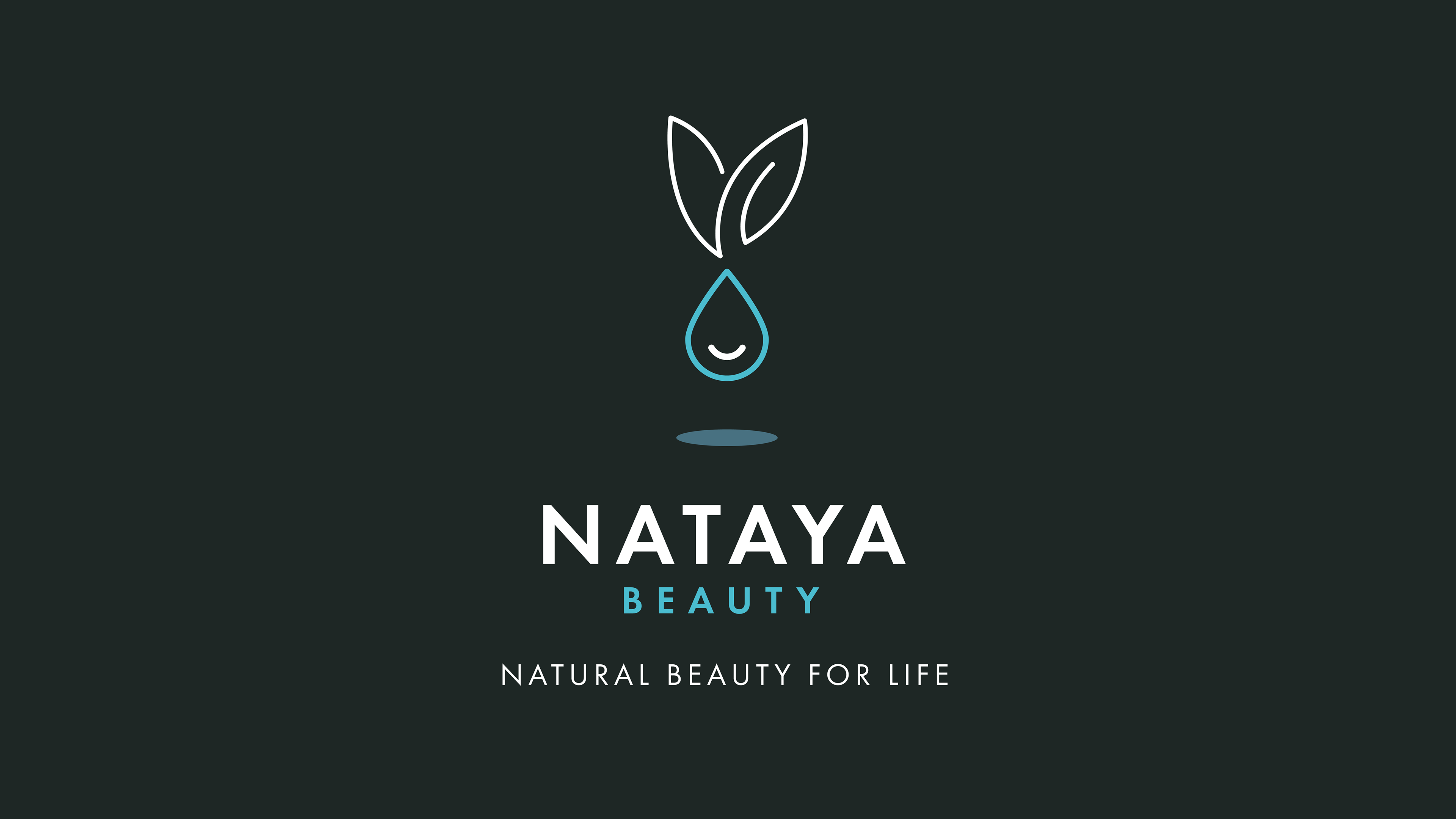
Nataya Beauty
Logo design for award winning vegan beauty salon.
The droplet and leaves (representing natural beauty) create a happy bunny (representing the client's passion for cruelty free beauty products).
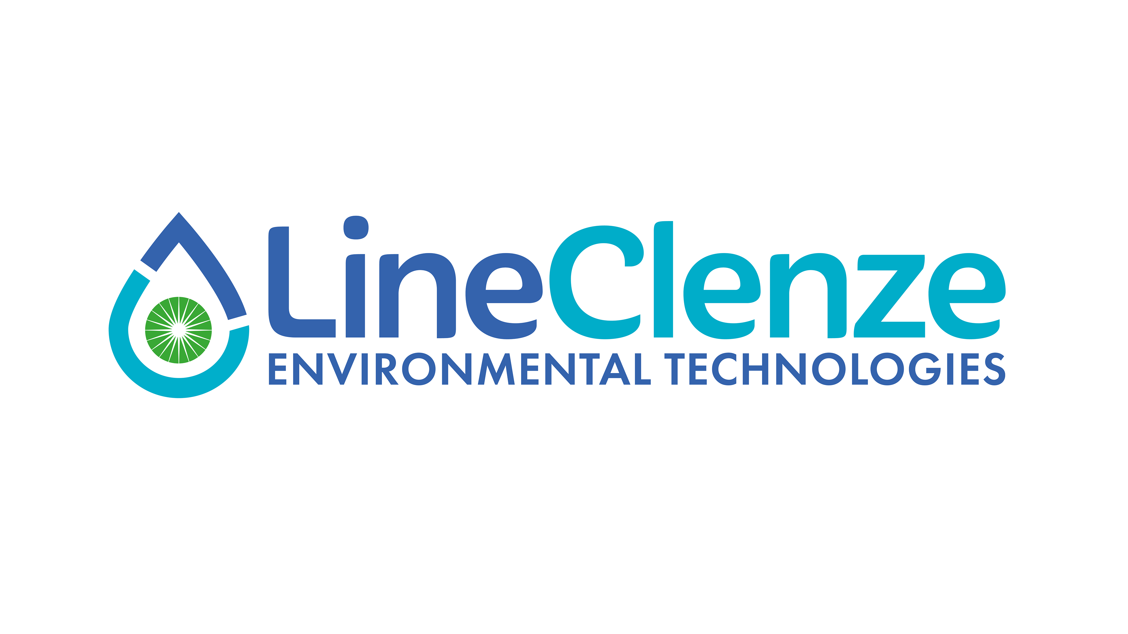
LineClenze Environmental Technologies
LineClenze maximise customers' profit through innovative environmental cleaning technologies.
Water droplet at the core with the central circle representing planet earth, the white starburst represents innovation. The water droplet is made up of an 'L' and 'C'. The tilting 'C' and circle also represent the dynamic people with innovative ideas
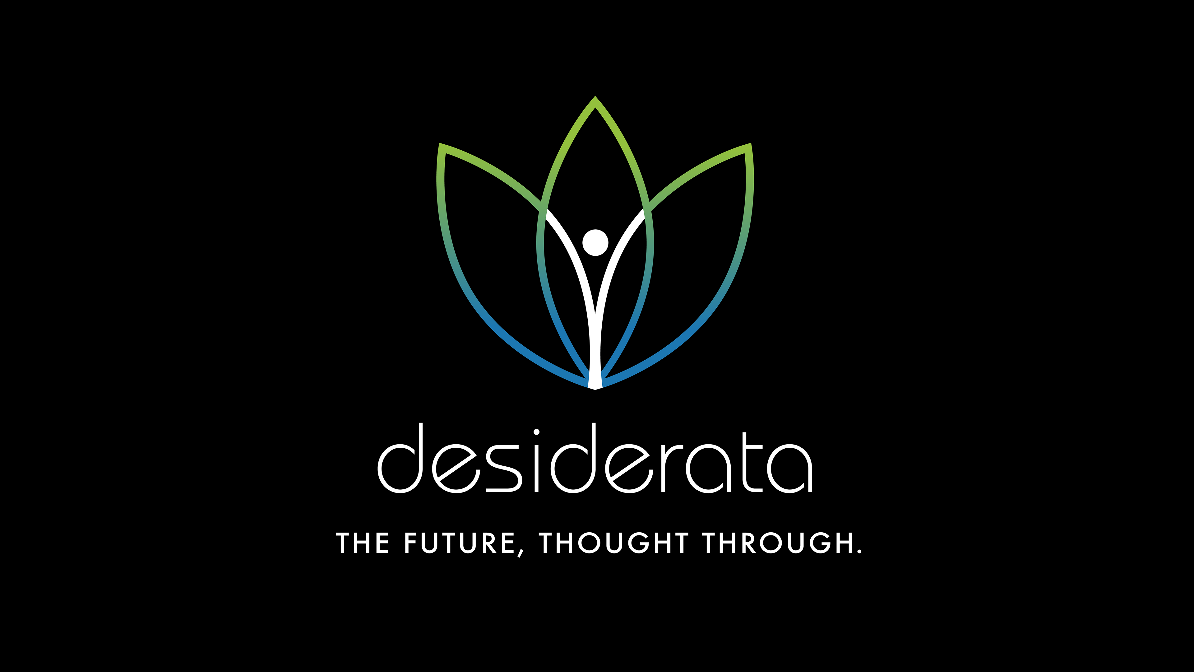
Desiderata Consulting
Brand identity and positioning statement for a management consultancy who specialise in complex global business transformation programmes for some of the world’s leading organisations. The logo reflects Desiderata's holistic approach to transformation, connecting processes, data and technology (the 3 interconnected petals) to empower people to excel (central figure).
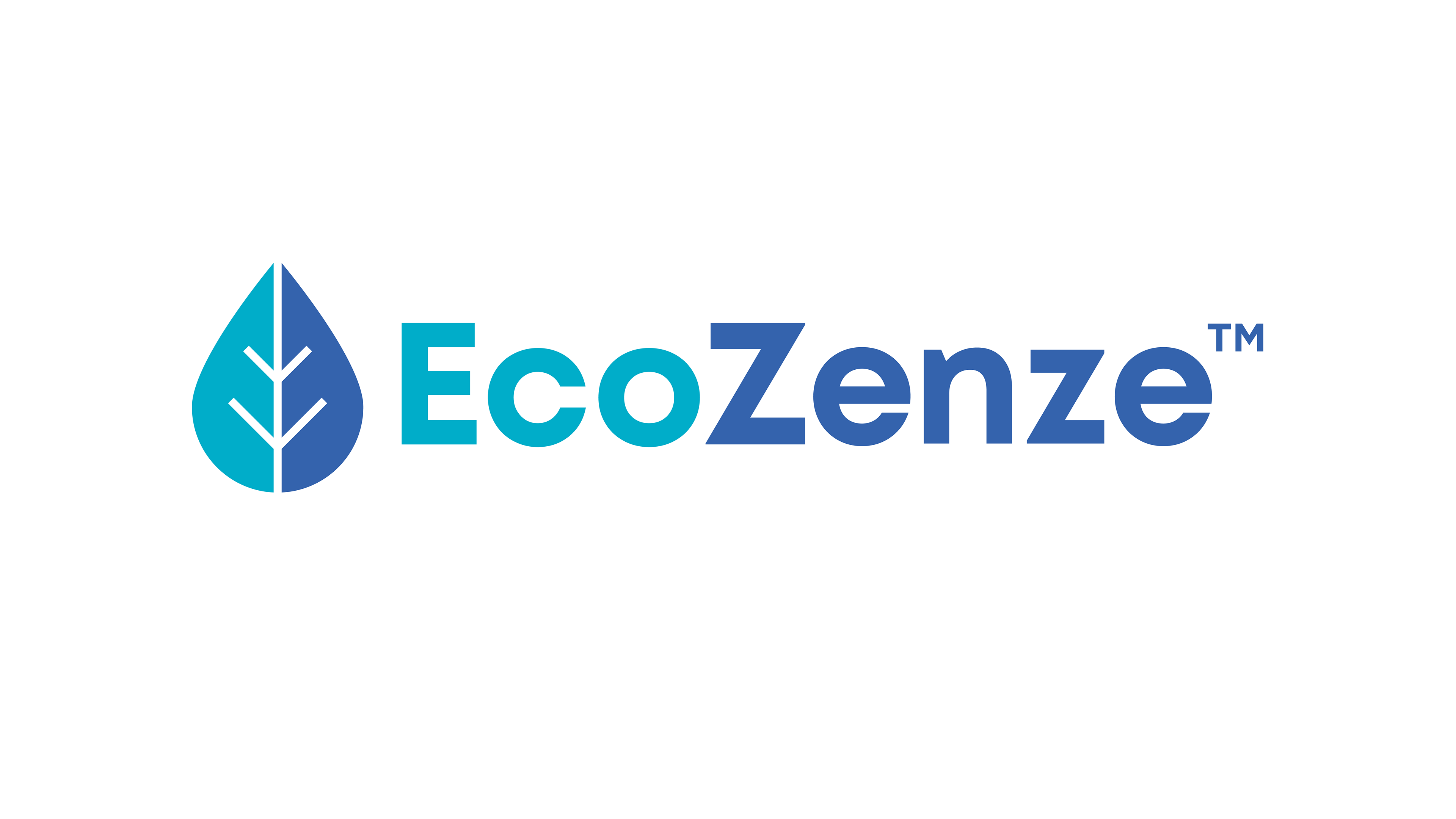
EcoZenze
Branding for EcoZenze, a non caustic, biodegradable beer line cleaning powder that is much gentler on the planet and not harmful to humans, animals or marine life. The droplet/ leaf symbol icon conveys the environmentally friendly nature of the brand.
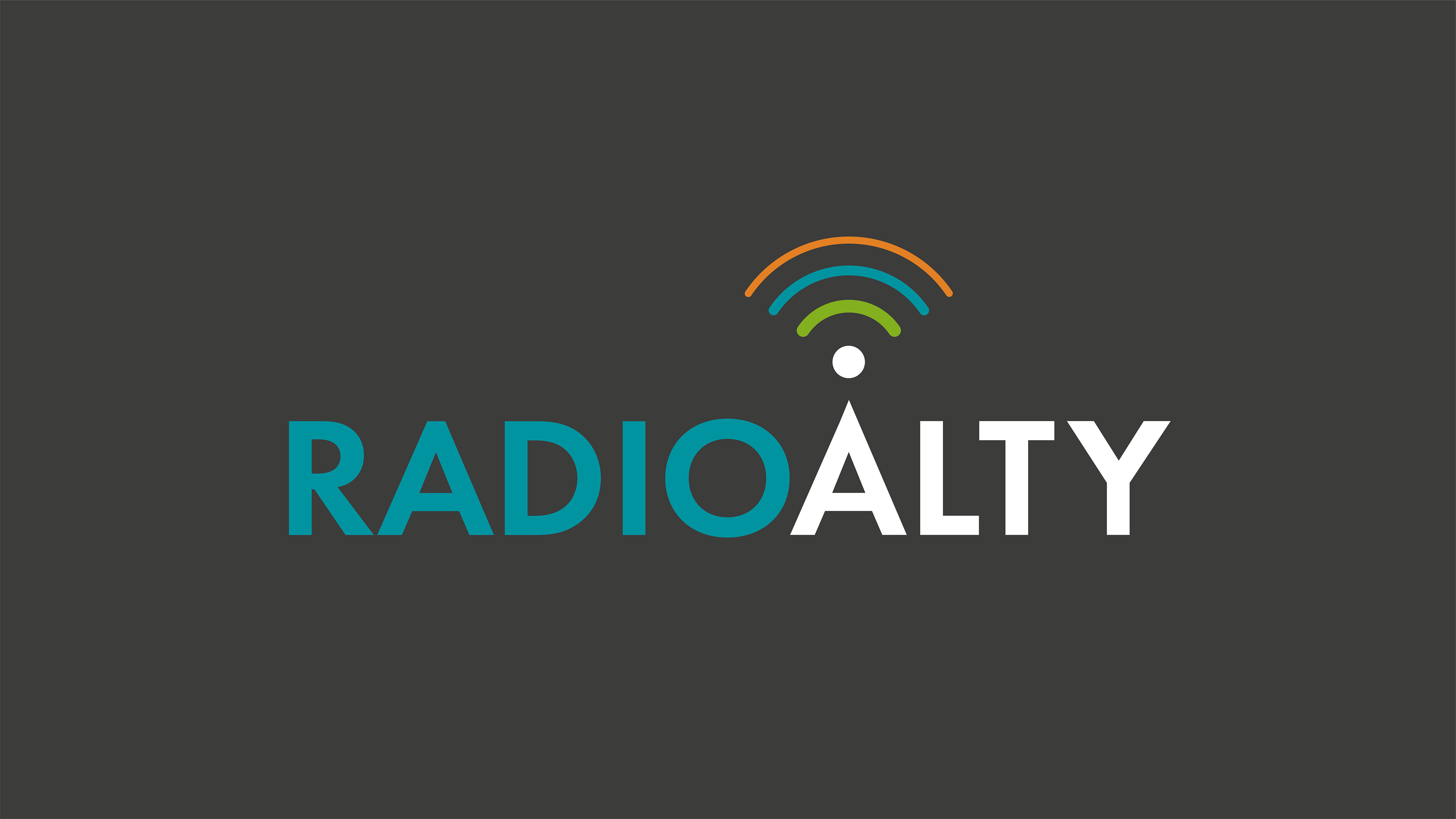
Radio Alty
Branding for a local community radio station in Altrincham. The oversized 'A' becomes a transmitter symbol and the wireless symbol represents that this is a digital audio service transmitted via the Internet.
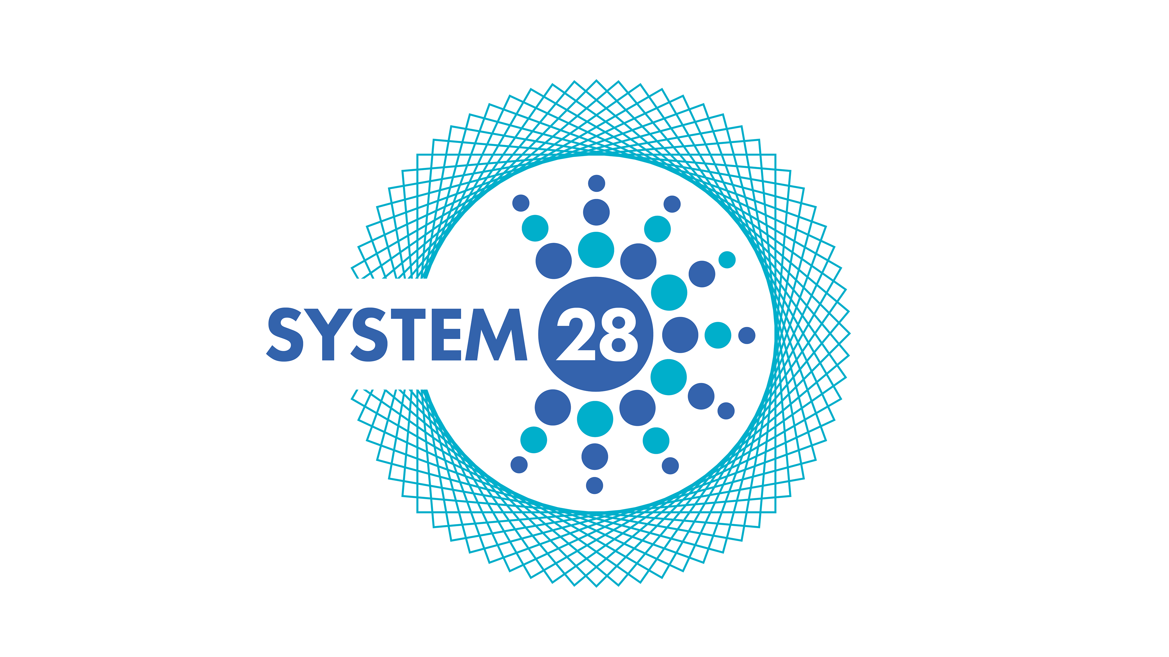
EcoZenze-System 28
LineClenze's EcoZenze System 28 is a non caustic, biodegradable beer line cleaning system that is much gentler on the planet and not harmful to humans, animals or marine life. The logo symbol visually reflects the system, the biodegradable, non-caustic cleaning powder and the outer electromagnetic field, that inhibits yeast growth and build up in the beer lines.
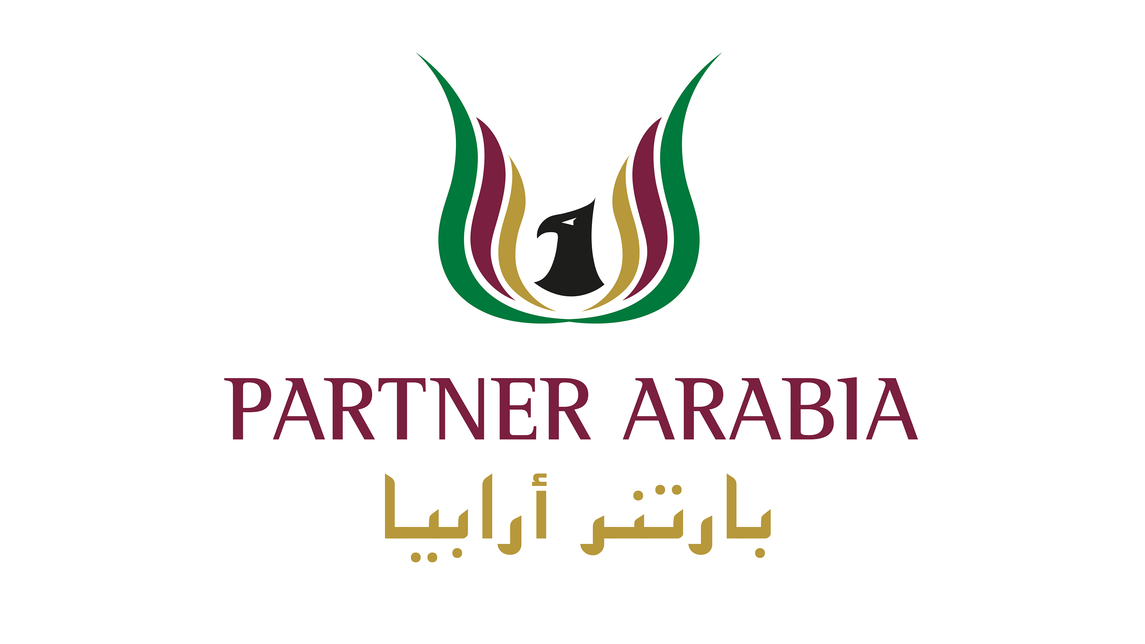
Partner Arabia
Branding for Partner Arabia, who source UK expertise for Middle Eastern clients and offer entry level strategies, advice and introductions for British exporters. The falcon is a status symbol in the Middle East and the abstract wings suggest control, collaboration and harmony.
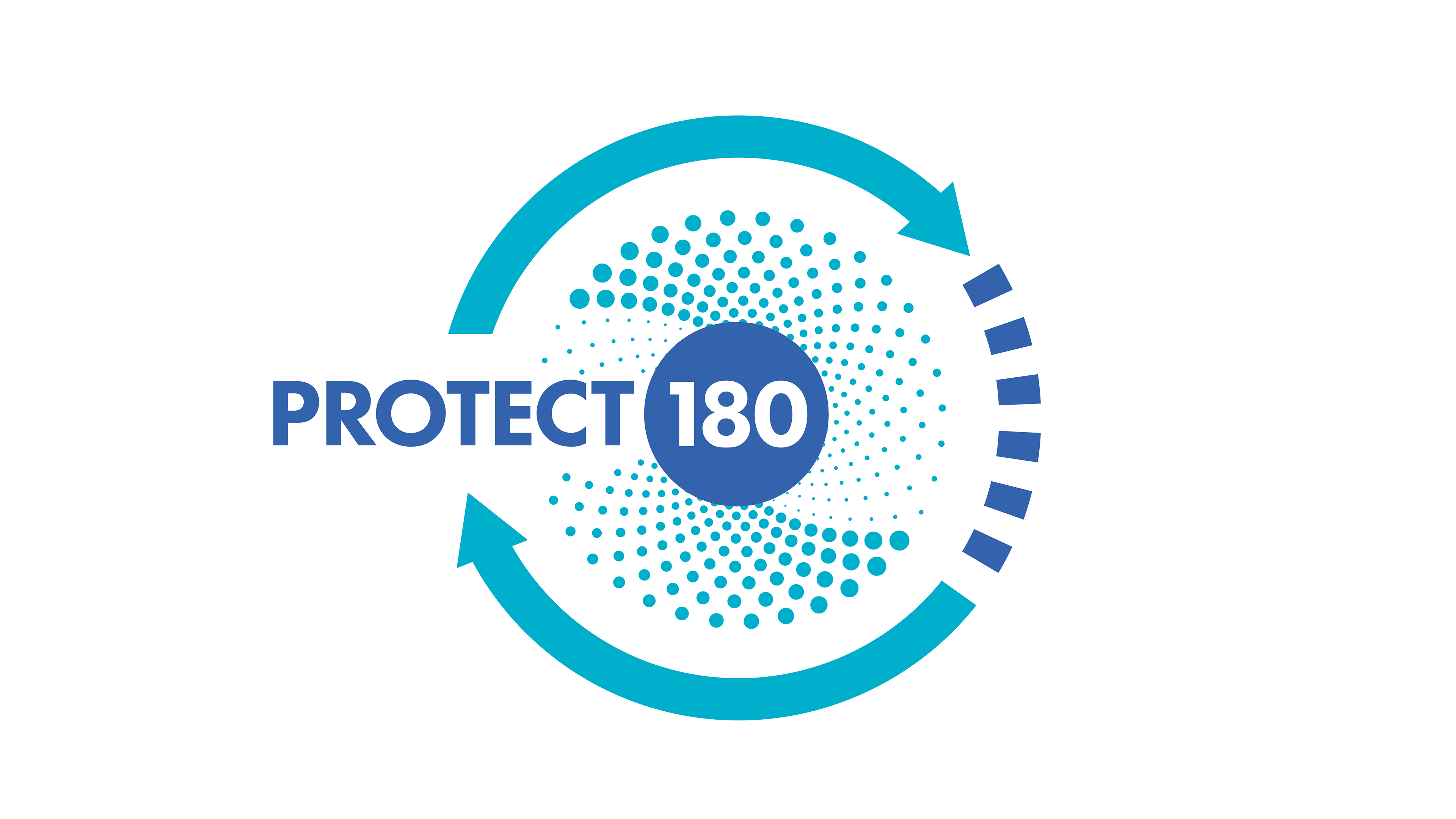
EcoZenze-Protect 180
EcoZenze Protect 180 Protect is designed to keep beer lines clean that are to be left unused for up to 180 days. Part of a family of EcoZenze products, that works closely alongside System 28. The logo device was the central element on the packaging.
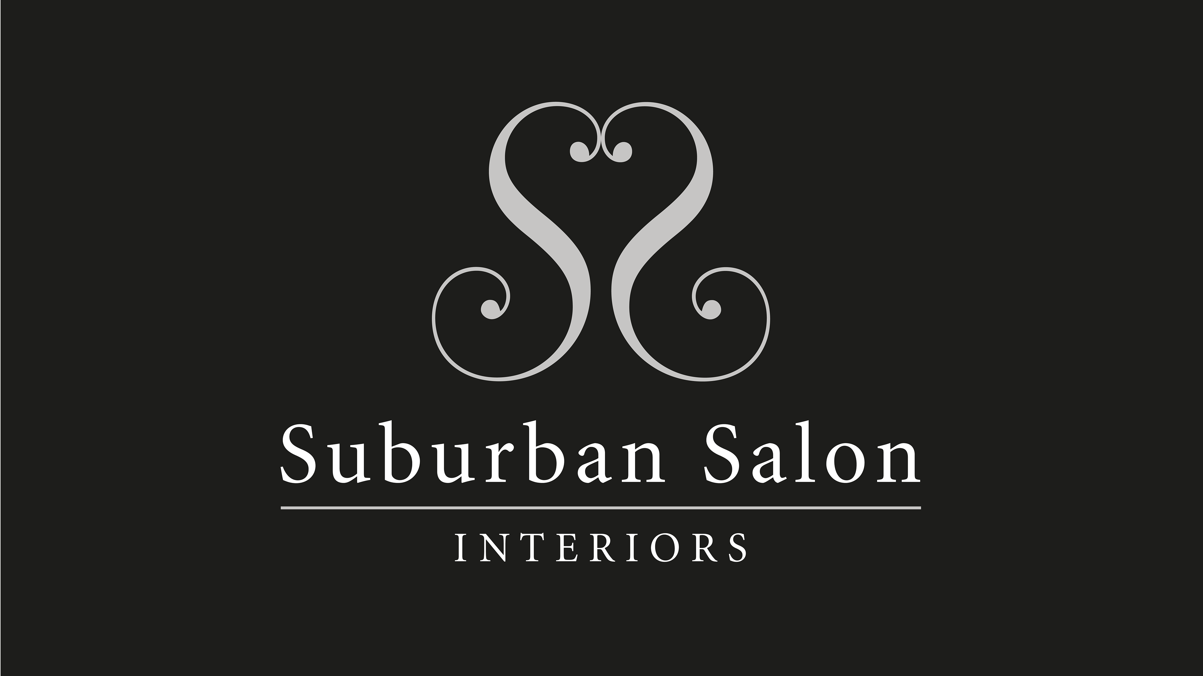
Suburban Salon
Suburban Salon Interiors sells beautifully handmade footstools, benches that have been upholstered in the softest, snuggliest sheepskin and faux fur. The two 'S's' reflect to form a distinctive, elegant Heart shape.
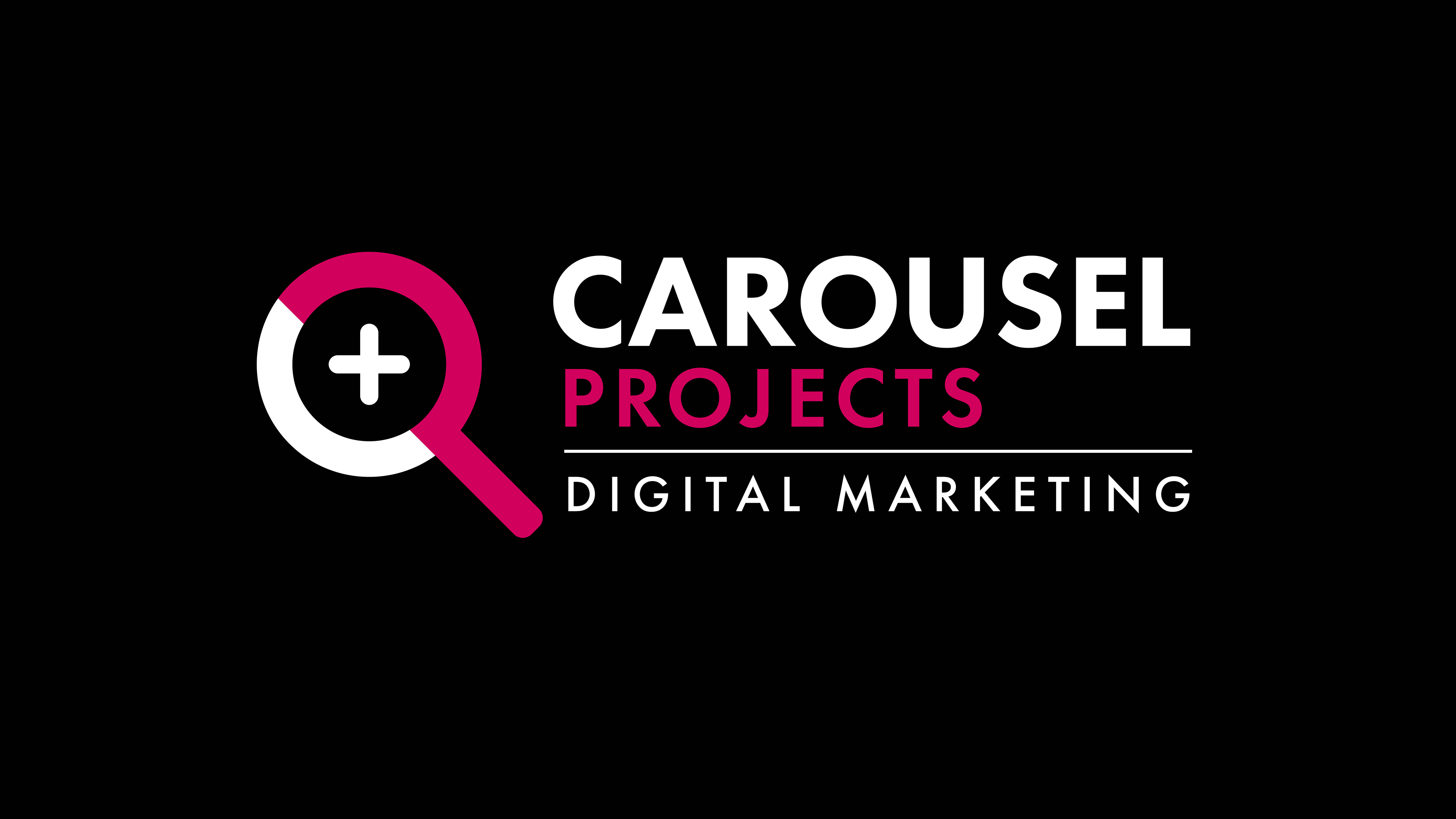
Carousel Projects
Carousel Projects is a dynamic, digital marketing company whose specialist expertise in intelligent SEO is central to their success. We created the iconic magnifying glass search icon from a 'C' and a 'P'. The '+' represents the measurable added value that Carousel bring to every project.
Appleyard & Trew
Rebranding for leading UK based Quanity Surveyors.

EcoZenze-Veritas
LineClenze's EcoZenze Veritas is an innovative alternative to caustic cleaners for wineries. A highly effective, biodegradable solutions that is much gentler on the planet and marine life. The pH7-8 nature of EcoZenze Veritas means that waste water is much easier to recycle for irrigation. The central whales tail with the halo above forms the shape of a wine glass, the water ripples and arrow represent recyclable benefits.
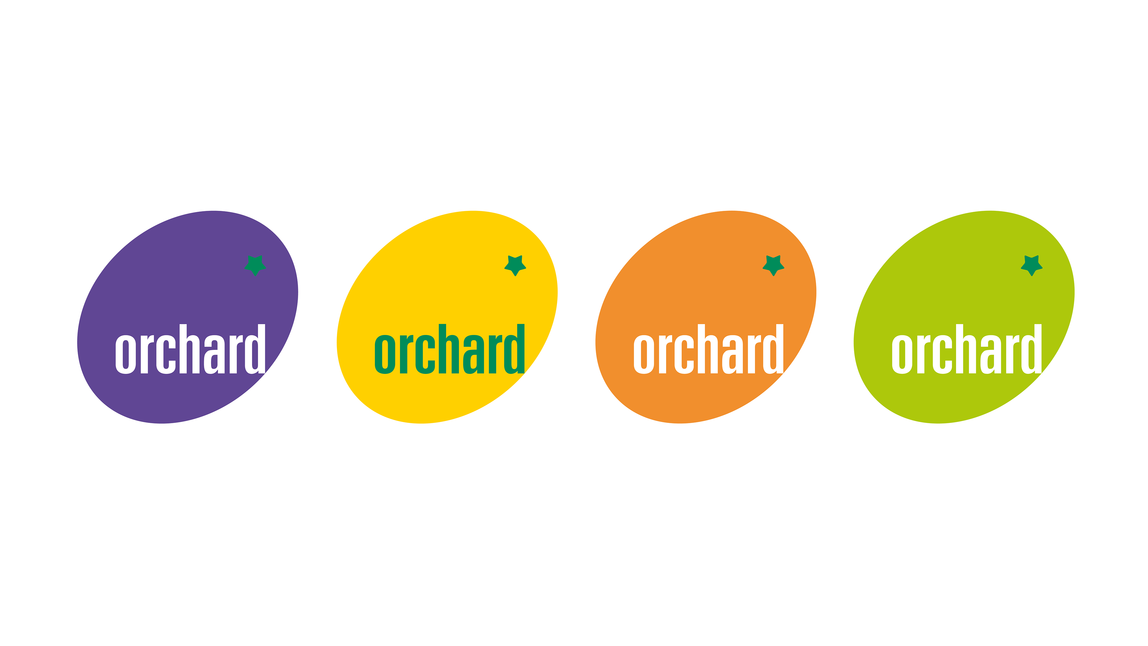
Orchard Recruitment
Brand identity for a leading recruitment company for the creative industries.
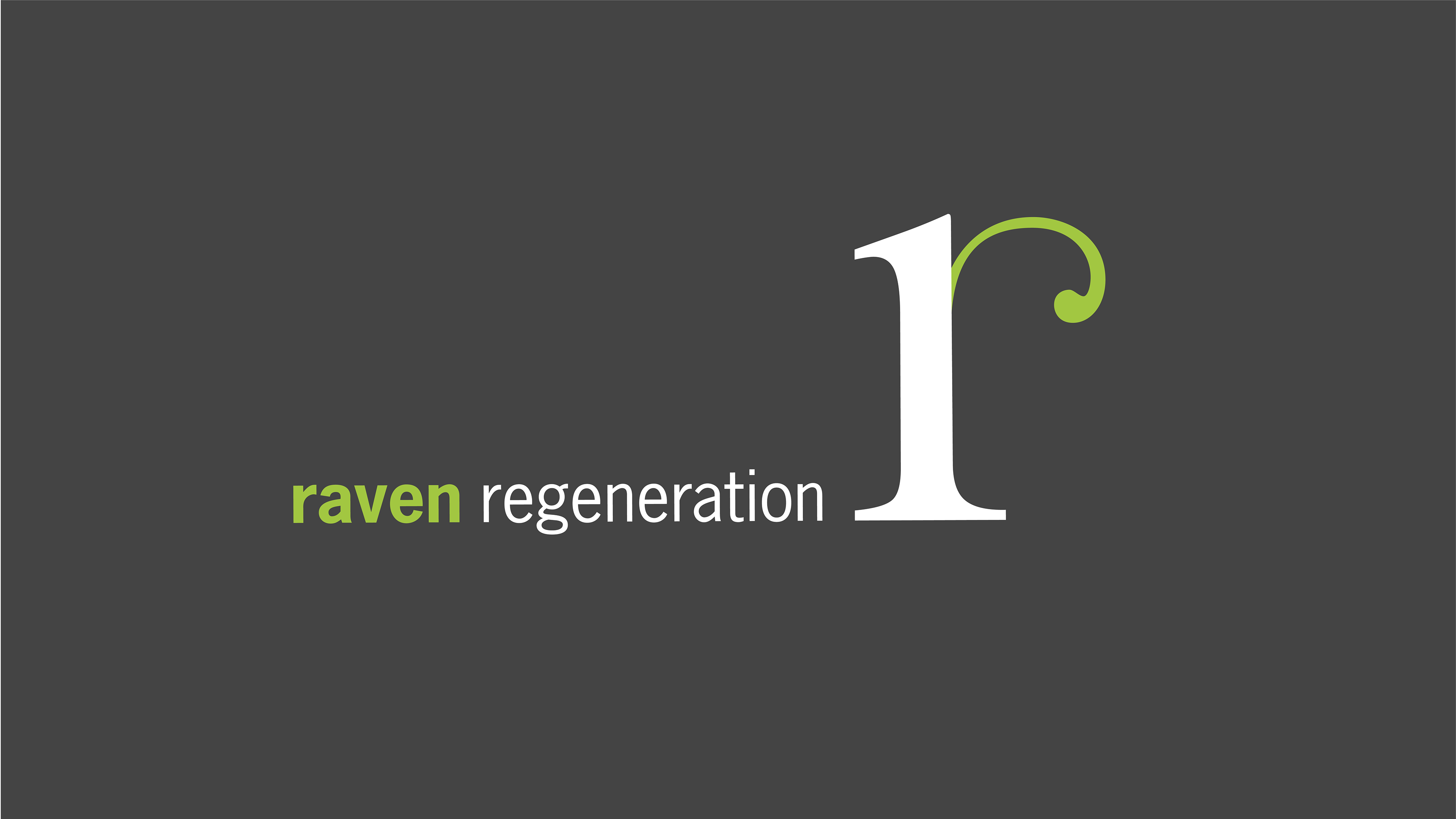
Raven Regeneration
Brand identity for Raven Regeneration, Manchester based housing regeneration consultancy.
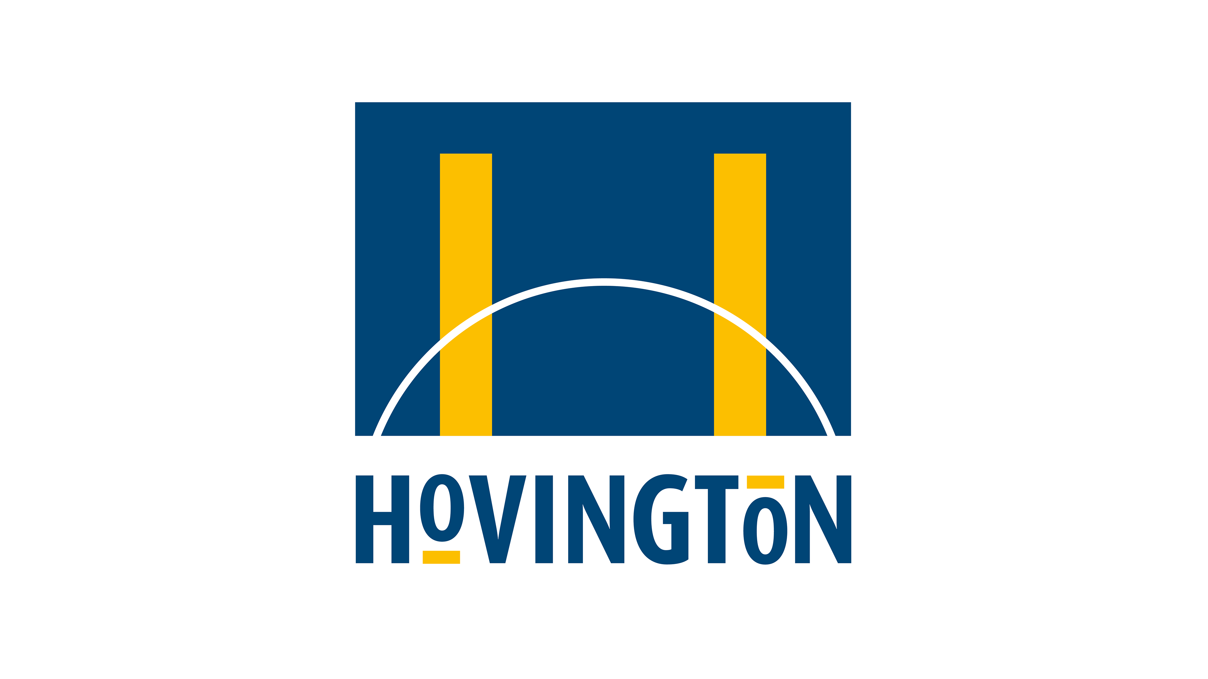
Hovington
Brand identity for Hovington Civil Engineering Contractors.
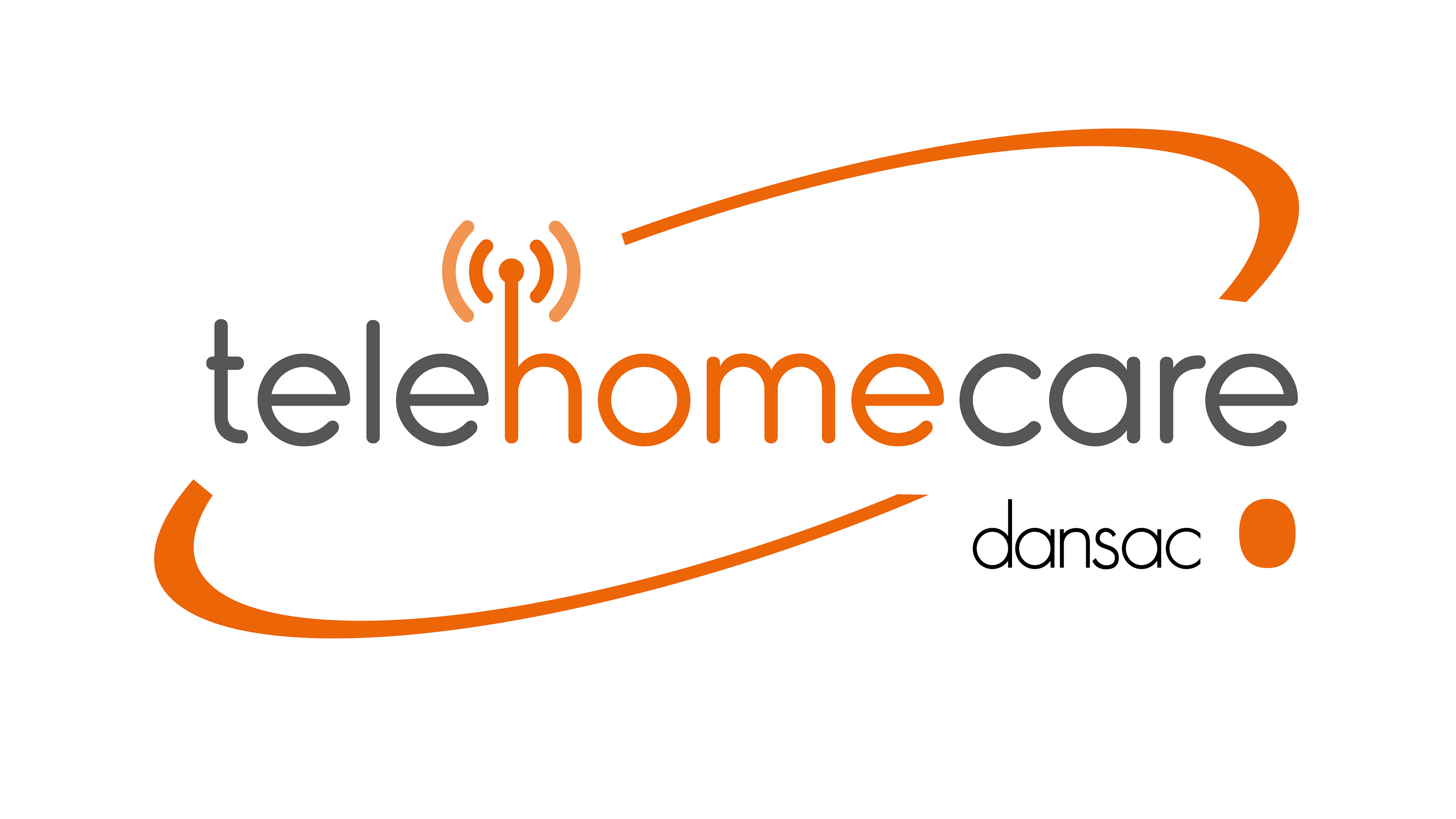
Dansac TeleHomeCare
Naming and brand identity for a telephone patient support service for Dansac UK.
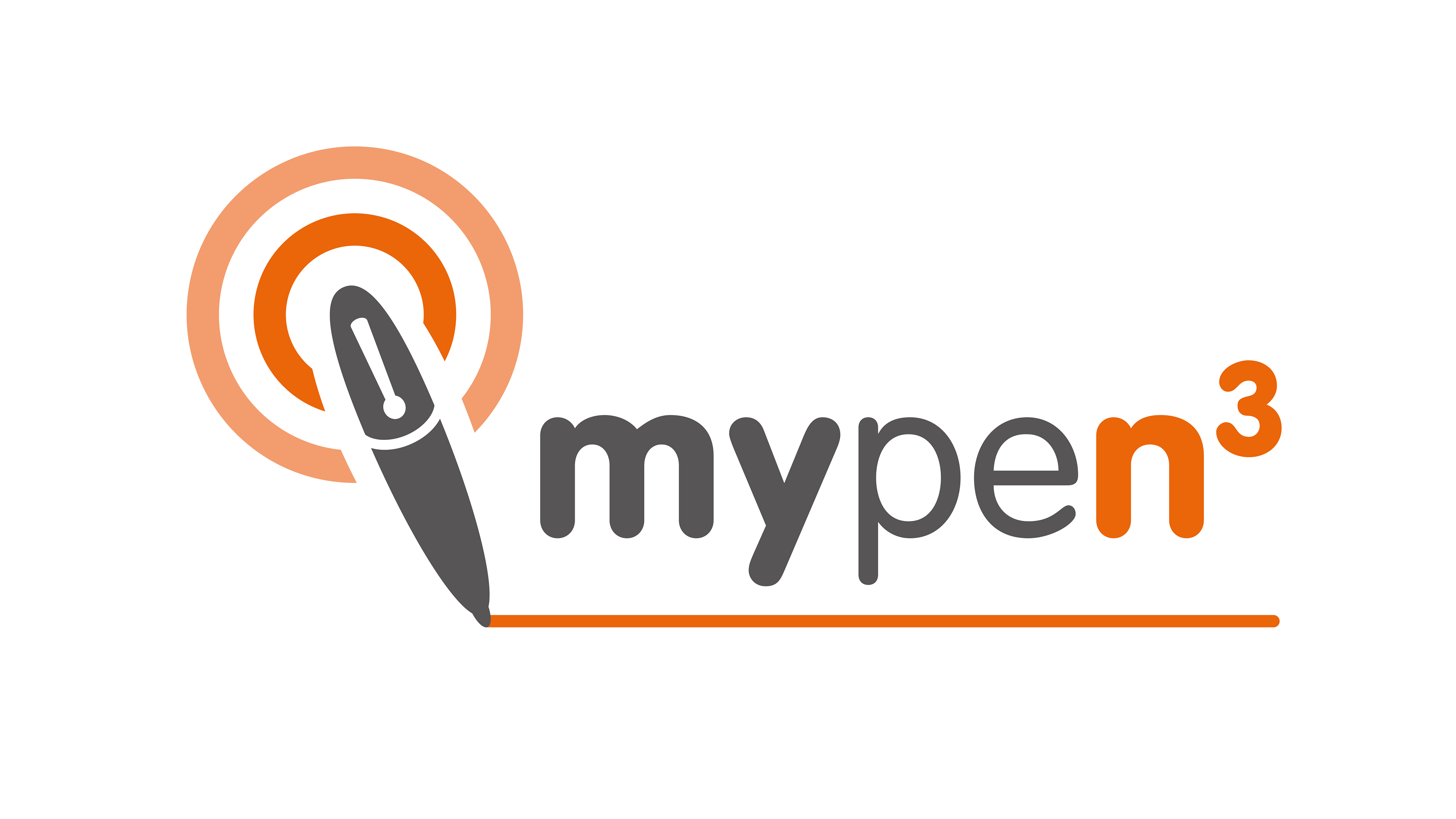
Dansac MyPen3
Naming and brand identity for an innovative digital pen solution, connecting nurses with the NHS’s secure N3 network.
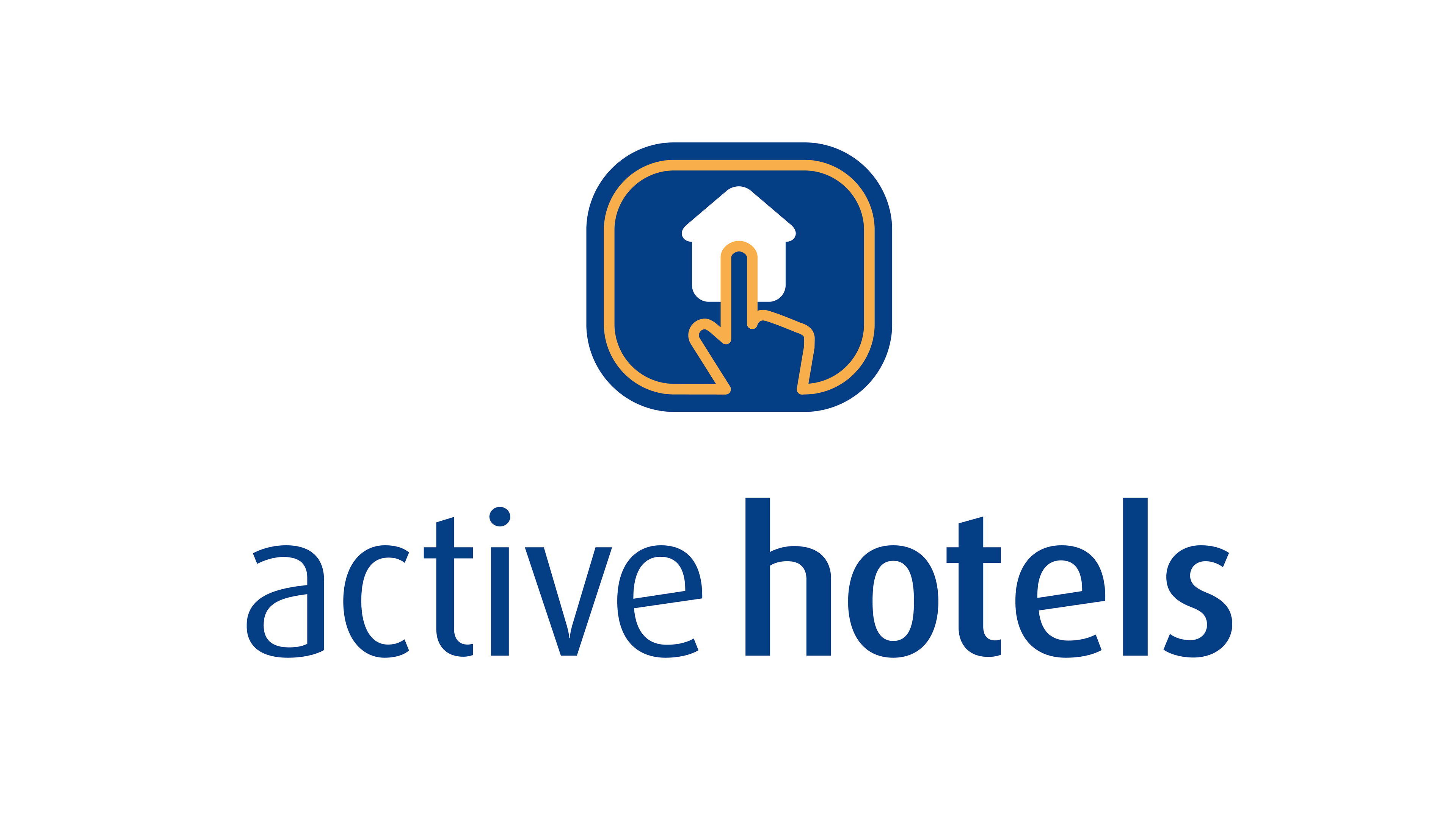
Active Hotels
Brand identity for tech start up Active Hotels, one of the original online hotel booking portals.
This Cambridge-based start up grew to become the largest online hotel booking company in Europe. It was bought by US travel retailer Priceline for £90 million.
Astra Zeneca- Quattro CRM Programme Branding
Brand identity for a global internal technology programme for AstraZeneca.
Astra Zeneca- Quattro CRM Programme Branding
Brand identity for a global planning programme for AstraZeneca.
Astra Zeneca- Quattro CRM Programme Branding
Naming and brand identity for a global business intelligence programme for AstraZeneca.
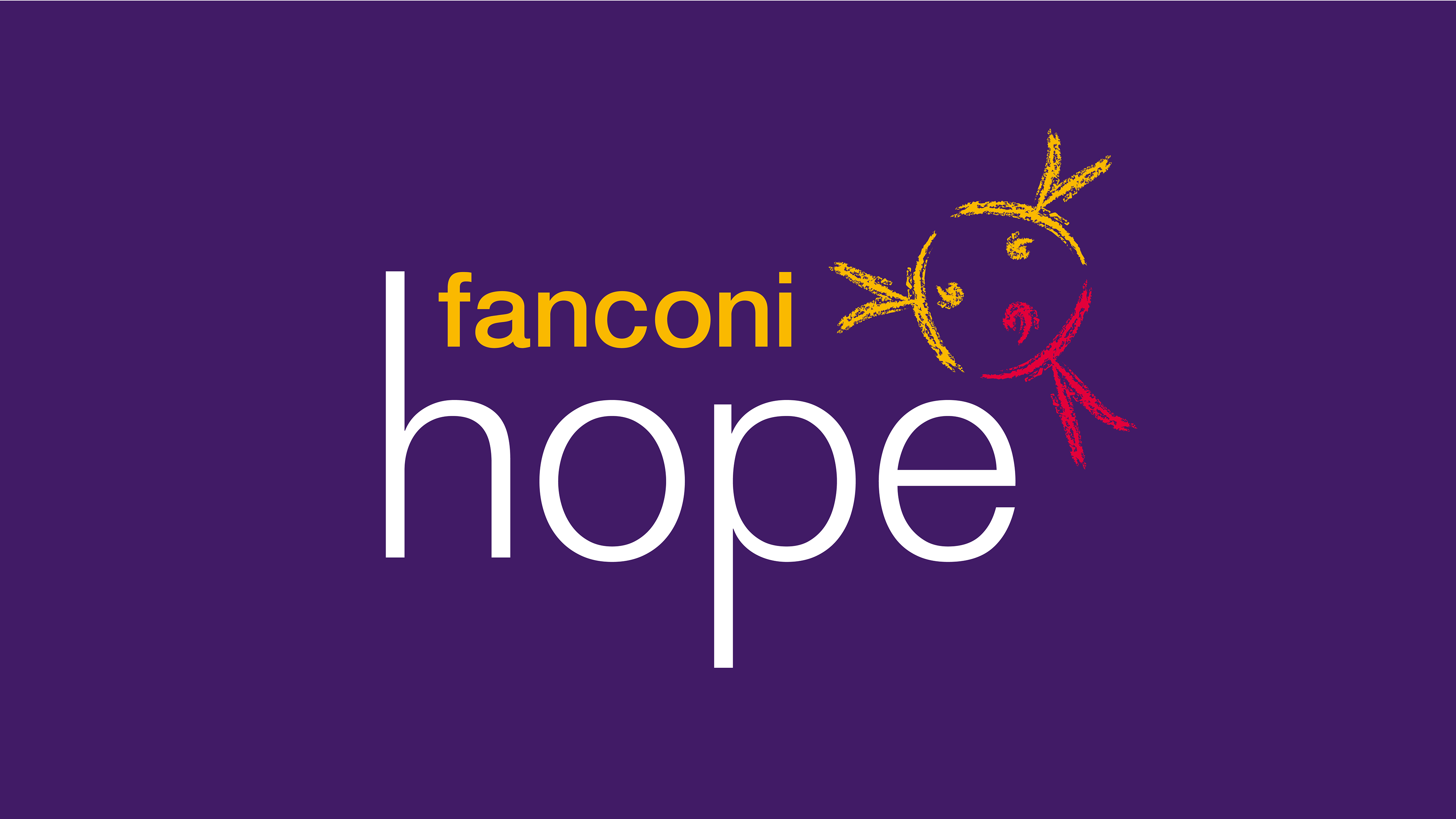
Fanconi Hope
Branding for a registered national charitable trust set up by parents of Fanconi Anaemia (FA) affected children and clinicians with an interest in FA. Fanconi Hope is a charity set up to sponsor research and support those affected by the rare genetic disorder Fanconi Anaemia that affects children and adults, leading to bone marrow failure and bone marrow transplantation, with very high risk of leukaemia and head and neck cancers. The three connecting figures in the logo symbol represents families, clinicians and the charity, that come together forming a child-like girl with pigtails.

Hart Vision Medical
Brand identity for a global healthcare company based in the USA.
Hart Vision make life safer for people who face challenges with balance and mobility. There products give people a higher quality of life through independence, freedom and rehabilitation; allowing people to stay in their own homes longer, enhancing their quality of life and extending their life expectancy.
Staxi Transport Chairs
Rebranding for Canadian based staxi, the world’s leading nestable transport chair.